Marketing Your Business: Branding | Part 4: Business Personality
- Geek House Data Dynamics

- Sep 15, 2025
- 7 min read

In case you are new to this series, we are turning our programmes into bitesize articles for free. Stay Tuned every Monday for a new part of the first of many series: Marketing Your Business.
In these articles, I take our written programme points, and where I would be on a call with someone and explaining them as well, I have blockquoted my summary and any add-ons that come to mind, like examples and case-studies.
Hi, It's me. In this episode we will go over picking colours and typography, creating logos, and.... The Sims?
Brand Voice, Tone & Personality
Establishing the voice and tone for a brand goes beyond surface-level considerations. It involves a meticulous exploration of the brand's fundamental identity. Is the brand looking to foster a warm, approachable rapport with its audience? Or does it aim to command respect and authority? Perhaps infusing a dash of whimsy into its messaging can give the brand a distinctive edge. Consistency in the brand's voice across various channels is not just important; it is imperative for building a cohesive and trustworthy relationship with its followers.
For example, with us as GHD2, we keep consistent with the geeky look, the friendly tone and then informal articles ;). We have found a way to get our voice and tone to remain consistent on Facebook, LinkedIn, and our own website. You will notice some brands are more friendly and informal while others - lets say a luxury brand - would stay more formal to keep that luxury tone consistent.
Visualize the brand as a living, breathing, entity characterized by specific personality traits. Is the brand synonymous with reliability, embodying traits like trustworthiness and dependability? Or does it epitomize innovation, constantly pushing boundaries and embracing creativity? It might radiate a welcoming vibe, encouraging customer engagement and fostering connections. Conversely, a brand with a luxurious persona may exude sophistication and exclusivity. Defining these personality traits serves to humanize the brand, guiding the choice of language and style in its communications. This not only ensures a unified message but also enhances the impact and resonance of its narrative.
By visualising the brand as a living, breathing entity. We are basically playing sims, designing our legacy sim. In the three trait boxes choosing if they are Friendly, Family Orientated, and Cheerful, or are they Macabre, Perfectionist, and Proper? Finding these traits humanise the brand and keep it consistent alongside the mission statement and vision statement.
Logo Design
When embarking on the journey of creating a logo for a brand, designers must immerse themselves in the brand's ethos, understanding its core values, mission, and vision. A logo serves as the visual representation of these fundamental aspects, acting as a bridge between the brand and its target audience. Beyond mere aesthetics, a well-crafted logo has the power to evoke emotions, trigger memories, and establish a lasting connection with consumers. It is through thoughtful incorporation of symbolic elements that a logo transcends being just a graphic and transforms into a storytelling device, encapsulating the essence of the brand in a single mark.
If we look at our logo:


With our name being Geek House Data Dynamics, we found a way to convey that, the geekiness through not only the bright colours, but the shape of the logo, to make it look like a stereotypical geek with thick rimmed glasses and sharp hair. Then inside the glasses we convey the data side with motherboard style connectors as a shine on the glasses.
The look is identifiable enough for us to change the colour to fit with LGBTQ+ Pride Month, or Mental Health Awareness Month, International Women's Day, and more. which are all things we care about as part of the business.
Remember, the impact of a logo lies not only in its intricacy but also in its simplicity. A minimalist design approach often proves to be more effective in conveying a brand's message, ensuring instant recognition and recall. By stripping away unnecessary elements and focusing on clarity and coherence, designers can create a logo that speaks volumes with minimal visual clutter.
A lecturer once said, "keep a logo simple enough for someone to be able to draw off of the top of their head". Which is why some brands have only a simple word or two as their logo... NEXT, Hobbycraft, Primark, to make it easier for someone to find.
Next time you are in a shopping centre or high street, look at the logos on the signage, see what keeps it simple, how it displays what the business is or what the vibe of the business is. See if you can make a sim with it.
Colours & Typography
The strategic selection of colours and typography can wield immense influence over how a brand is perceived by its audience. Colours have the ability to evoke specific emotions and associations, with each hue carrying its own psychological impact. By choosing a colour palette that aligns with the brand's identity and values, designers can evoke the desired emotional response from consumers. Similarly, typography plays a pivotal role in shaping the brand's personality and tone. From elegant serif fonts exuding sophistication to playful handwritten scripts radiating creativity, the choice of typography can convey subtle nuances about the brand's character.
Taking a look at snippets of our branding guides, can you guess what business' they are for or what vibe they are supposed to give off?:
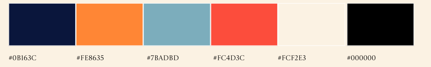

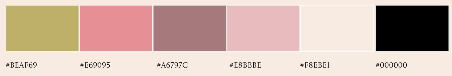


This is how we show our colours, We check with a specialist website to check how readable lettering is (Just because you may be able to read it doesn't mean everybody can). And then we find colours that fit the desired look that convey the "sim".
Starting from the top, the colour guide is for an eyelash business who wanted to show their bubbly bright personality. The middle one is a beauty parlour that wanted to convey luxury. And the bottom one is for a murder mystery board game company, we chose dark colours like the grey and the red for the murder mystery aspect but also lighter colours for contrast being the green and gold to match the apothecary greenhouse look.
For instance, a brand aiming to communicate a sense of trust and reliability may opt for a classic serif font, while a brand targeting a younger, more dynamic audience might lean towards bold, contemporary typefaces. The harmonious interplay between colours and typography can create a cohesive visual language that reinforces the brand's messaging and resonates with its target demographic.
We don't just pick colours and stick them on the guide, we choose colours that work well together. Not just picking a green but a shade and saturation of green that compliments the background while also conveying the vibe of the brand.


With fonts, again they have to be readable and not just aesthetically fitting, sometimes clients already have a font created from Canva or Vistaprint, in which case we need to find a similar font style that not only works with what we are trying to convey, fits the vibe, but now also fits the pre-made logo.
Imagery & Design Elements
Consistency in imagery and design elements is paramount in building a strong and recognizable brand identity. By establishing a coherent visual style that permeates all brand assets, from marketing materials to digital platforms, a brand can cultivate a sense of familiarity and trust among consumers. Whether through striking photography, captivating illustrations, or unique design elements, each visual component should align with the brand's overarching aesthetic and values.
If we look at the imagery designed for the murder mystery company:


we chose artistically drawn and coloured flowers and greenery and birds to convey an apothecary feel along side skulls to convey the murder mystery part.
By maintaining a unified visual language, brands can convey a sense of professionalism, authenticity, and reliability to their audience. Consistency in imagery not only enhances brand recognition but also fosters a sense of connection and loyalty among consumers. Through a thoughtful curation of visual elements, brands can craft a compelling narrative that resonates with their audience, leaving a lasting impression and forging meaningful relationships.
The final product becomes who they are and how you are meant to perceive them:

Example
When establishing a sustainable brand, it is crucial to consider the colour palette and design elements that will effectively communicate your eco-friendly message to your target audience. Soft greens, beiges, and earthy tones are not only visually appealing but also symbolize nature, sustainability, and harmony with the environment. By incorporating these colours into your brand's visual identity, you can create a sense of calmness and connection with nature, which resonates well with environmentally-conscious consumers. Furthermore, adopting a minimalistic approach to design can enhance the overall message of sustainability. Simple and clean design elements help convey a sense of transparency, honesty, and efficiency, which are key values associated with eco-friendly practices. Nature-inspired motifs such as leaves, trees, or water droplets can add a touch of organic authenticity to your brand, reinforcing the idea of being in harmony with the natural world. By carefully selecting colours, design elements, and motifs that align with the principles of sustainability, your brand can establish a strong visual identity that not only attracts environmentally-conscious consumers but also conveys a clear and compelling message of eco-friendliness.
Again the message to carefully select colours, design elements and typography you create your brand and how you want it to be perceived. A reminder that colour theory exists, and this is a use of that. However, if you use a scattered red through hospital corridors to lead it patients because red means hope, that will just be perceived as blood. So understand your "audience" (Location/customers).

We post these every Monday at 3pm, join our mailing list for updates!
We offer Branding Alignment services including Business Launch Bundles, which all include the branding alignment.


Comments