Branding and Media - PW
- Geek House Data Dynamics

- Aug 6, 2025
- 4 min read
Service Type
Branding Alignment and Custom Content
Company Type
Pub, Micro Business
Date & Length of Project
December 2022 - November 2024
Project Overview
Client Needs
After stabilising their finances and realigning their entertainment offering, The Pendle Witch turned its focus toward strengthening its brand identity and expanding its digital presence. They needed to shift from a functional but dated look into something more cohesive and professional - without losing the heart and soul of what made the pub so special.
Problems To Solve
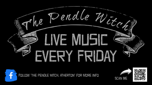
Up until 2022, The Pendle Witch relied heavily on the photo of their pub sign as the central visual across social media and marketing. While charming and recognizable to locals, it didn’t translate well across platforms or feel consistent when used in different formats. The brand lacked a unifying aesthetic - no defined colours, fonts, or visual rules - making their online presence feel disjointed and less impactful than it could be.
Approach
From December 2022 to June 2024, we led a full branding realignment and content transformation. This included designing a custom logo that captured the spirit of the pub, creating a full brand alignment guide with fonts, colours, and imagery, and rolling out custom content across digital platforms. We combined storytelling with striking visuals to bring the brand into the modern era while keeping its folklore charm.
CREATING FOUNDATION |  | Step One was creating the foundation - a complete rebrand that honoured the old while embracing the new. We designed a custom logo rooted in local folklore and mysticism, which could be used cleanly across posters, screens, menus, and merchandise. We then built a brand alignment guide outlining core colours, fonts, and imagery styles so that any future material—whether created by us or the in-house team - would stay visually cohesive and recognisable. |
|---|---|---|
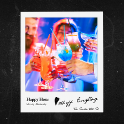
EXECUTION FOCUS | | Step Two focused on execution: rolling out the new branding across every customer touchpoint. We produced dozens of posters for weekly events and themed nights, custom-shot videos that blended pub life with creative storytelling, and digital ads optimised for Facebook and Instagram. Every piece was consistent with the new branding and tailored to build familiarity with the new visual identity. We treated social media not just as a platform, but as a storytelling tool. |
TRACKING IMPACT AND REFINING | | Step Three was tracking impact and refining. The content we produced drove engagement well beyond their usual reach- across the campaign period, The Pendle Witch saw over 6k reactions and significant growth in post shares, comments, and foot traffic driven by online promotion. Starting with the 1.5k initial reaction as we started the service. Perhaps more importantly, the pub now had a visual identity that felt deliberate, expressive, and unique. Looking back, this wasn’t just a rebrand- it was a resurrection of the pub’s personality, allowing it to stand out confidently in a saturated local market. |
Deliverables

ABOUT COMPANY
The Pendle Witch is a popular real ale pub, known for its cosy atmosphere and historic ties to the local area. It has long been a favourite spot for both locals and visitors.
The Pendle Witch chose us to help revitalize their brand and grow their customer base. Our expertise in branding, social media, and entertainment strategy was the perfect match to elevate the pub's unique atmosphere. By focusing on targeted marketing and creative content, we were able to highlight The Pendle Witch's charm and bring in a broader audience.
Branding Overview
Our approach to branding is centred around understanding the client's vision and aligning the brand with their unique identity. We start by evaluating what they currently have in place and gathering detailed insights through a questionnaire. This allows us to get a clear picture of what the client envisions - whether they prefer neutral colours, a witch-themed look, dark and moody tones, or a modern aesthetic. Since the client knows their business best, our goal is to create a bran that they are truly happy with.
Research:
Understanding the client's industry, target audience, and competition.
Identity Development:
Crafting logos, colour schemes, typography, and other visual elements.
Brand Guidelines:
Creating a comprehensive guide to ensure consistency across all platforms.
We also assess what the logo needs to achieve - whether it serves as a strong identifier or fits seamlessly within an existing theme. Often, we draw inspiration from images provided by the client, such as those used in menus or social media, ensuring the branding reflects their location and character. We refine these images, adjusting colours for balance if necessary, to create a cohesive and visually appealing identity.


Testimonials
Before, we were just winging it with social media. Now, people actually stop me to ask when the next event is, or compliment our posters. It’s made the place feel exciting again. The branding finally matches the vibe inside the pub - witchy, local, welcoming. And they helped us do it in a way that didn’t feel like a big corporate thing. It still feels like us, just better.


Comments